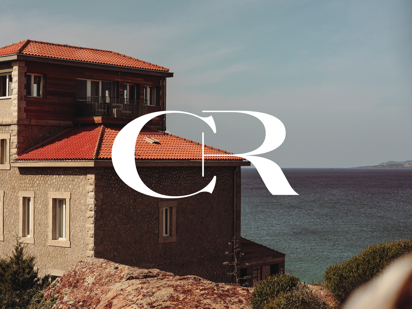
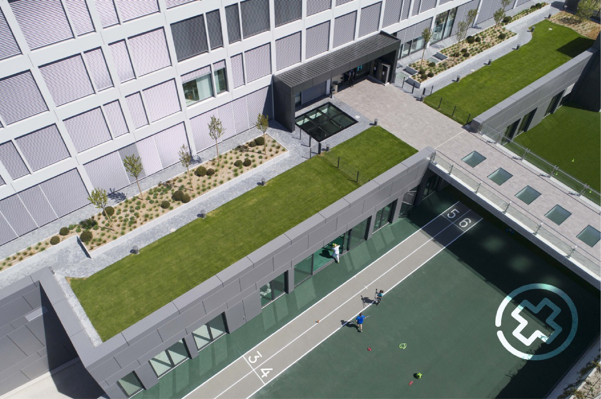
As The Hôpital de La Tour in Switzerland evolved into a medical group with diverse specialities, defining a cohesive identity became a strategic priority. The challenge: to unify its entities while ensuring adaptability across existing branding and communication tools. The solution: a redesigned ‘H’—a symbolic signature representing unity and technical expertise. Project completed with Marks (marks.gr)
SERVICES: BRANDING, STRATEGY, BRAND GUIDELINES, VISUAL IDENTITY, WEBSITE DESIGN, STATIONERY


PHOTOGRAPHY: Raffi Maghdessian